Archive for the ‘Human Computer Interaction’ Category

For this task I was required to create a test plan to show how the device can be used and to iron out any potential bugs in the device’s.


Train Routes Test Plan

 The following document is a test plan for the Train Routes interface that I designed.

Train Routes – Test Plan

Author: Michael Russell Date: 20/12/2011
Element to Test Expected Result Result Successful (Y/N)
Start Device The device should start without any issues The test was successful. The device ran without any errors. Y
Close device The device should close without any complications The test was smooth and no errors occurred when the device was closed. Y
Return to main screen The screen should return to the main page The screen successfully returned to the main page Y
Display information for each train station The device should output the correct information for each train station The device successfully outputs information regarding time for each train station Y
Display information about the train The device should display information about the train The device successfully shows how many passengers are on the train Y
Display information about each train carriage The device should display information about the individual carriages of the train The test was successful and the device shows how many passengers are in each carriage Y
Move from each point The device should allow the user to move from each point such as the train and the station without showing display errors The test was successful and no display errors were present Y

Teachers Assistant Test Plan


The following document is a test plan for the Teachers Assistant interface that I designed.

Teachers Assistant – Test Plan

Author: Michael Russell Date: 20/12/2011
Element to Test Expected Result Result Successful (Y/N)
Start Device The device should start without any issues The test was successful. The device ran without any errors.  
Close device The device should close without any complications The test was smooth and no errors occurred when the device was closed.  
Click Each Shape The screen should output the word for each shape The screen successfully displayed each represented word for the shapes Y
Audio output square The device should output audio that represents the shape. The device spells the word square each letter at a time and then the word itself Y
Audio for other shapes The device should output audio for the other shapes without spelling it first The device successfully says the word for each shape Y
Run each shape The device should continue to run and only show the shape clicked on The test was successful and only the shape clicked on was displayed  


This task is simply the instructional documentation for the 2 devices that I’ve designed. You should expect to find very basic instructions along side a possible maintenance scheme for the device’s.

Nursery Shapes User Guide

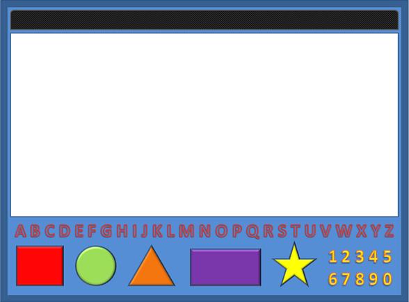
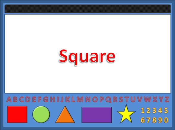
The nursery school shapes system is more of a teacher’s assistant device. It offers various learning techniques in a format that could be considered enjoyable to the students. The device is relatively simple but could be capable of increased functionality via an expansion bay that allows you to load external programs through a card. There would also be the possibility of programming the voice for the device instead of relying on the default voice. The default function of the device is to teach letters, words, numbers and shapes. The device has 2 main types of input, touch through the pushing of buttons and voice. The teacher or student could press the square button for instance and the device would say in a pre-recorded voice in the following way. S – Q – U – A – R – E. SQUARE.

The device would then display the word square as shown below with each letter being said individually and then the word be said at the end. To make it clearer to the students it would also be possible to emphasise in a visual way which letter is being said by the device. This could be done by highlighting it or making it pop out more than the other letters.

Maintenance

This device would require little maintenance once the final build is complete because it will have the option to load compatible third party software via the expansion bay. The software would only be loaded into temporary memory to prevent any permanent changes to the device. In order to make changes to the default software the chip would have to be sent for reprogramming. There is the possibility of remote updating via USB cable. The device could be plugged into a computer system and receive updates from a server.


Train Routes User Guide


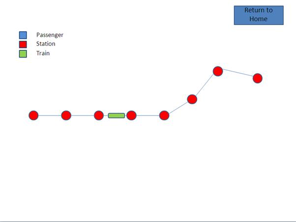
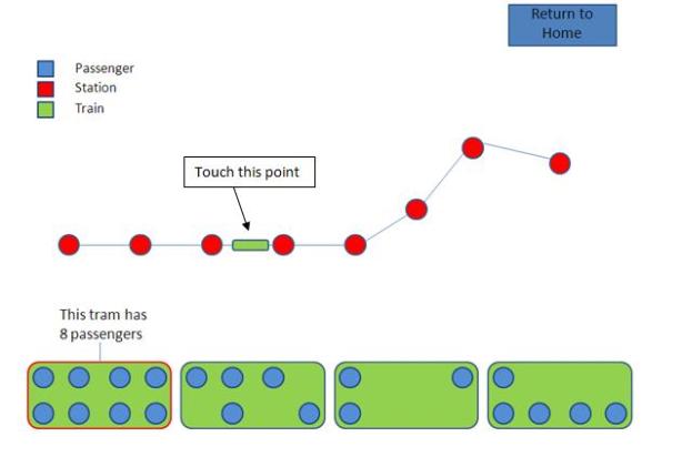
The train routes system would be implemented at numerous train stations around the country and possibly the world. The preferred method of implementation would be to have it displayed on a plastic or strong glass touch screen at various locations in each station. The board will allow you to touch points to find out more information about them. I.E. If you look at the image below you can see a train shown in green which is just before the half way point on the track. You would be able to see the train move in real-time down the track until it reaches your location. You would also be able to check on demand how many passengers are on the train. This means that you would be able to see how many people get on or off at each station until it reaches yours. This could be extremely useful in order to judge which train cart you should attempt to board. It would make more sense to get on a train cart with 2 people occupying it rather than getting on a cart that is full.


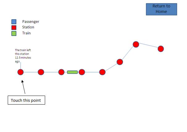
If you take a look at the image below, you can see that it is also possible to click each station to determine how long ago the train left that station and how long is expected until it arrives at your station. This is a useful feature as far as time management goes. It could also allow you to calculate your estimated travel time.


The image below is just an example of how you might view how many passengers are on the train.


Maintenance

In order to maintain the device I would highly recommend that the glass or plastic used to display the system is very heavy duty. This is to avoid weather related damage and criminal damage. The system would be maintained via a port that is protected by a lockable box. A laptop with the correct software and driver could be connected to the device via a USB cable with a unique connection the other side. Once plugged in the board would go offline and a security code would be entered. Once the code has been entered correctly a control panel should become accessible in order to change small settings. Any major changes would require new code to be written to the devices chip. A remote authentication system could also be a good idea in order to help fight hacking attempts.

For task 3, I have been asked to explain some of the fundamental priciples that when followed help to ensure your new design will be a successful one. I have also been asked to design a DAB Radio to give my clients a more visual idea of what goes into a device’s design.

Fundamental Principles of Interface Design

Perception – The GUI needs to be designed in such a way that anyone who comes across it is capable of using it. The end user may have a required specification but they are usually unable to consider the detail that the designer would in order to make the interface suitable for the intended users. There can be multiple people involved with the design of an interface; the end user, the interviewer, the designer and clients. The perception that each of these people have of the interface would almost always be different so a more general approach or view of the interface should be agreed upon. The perceptions the people have that are involved in the design of the interface are vital to ensure that both teachers and students can effectively use the device.

Colour The combination of colours is important to ensure the end user has an enjoyable or at the very least acceptable experience with the interface. The colour combination used with an interface is more than just pretty effects to make the interface attractive; it can play a big part in how effective certain aspects to the software are. An example: Software that display heat in a graph. If the colour scheme is badly designed and the gradient is very random then there is a big chance that none of the information would make sense.
Luminance Luminance is a term for a specific system of colours that allows for better visual effects therefore it should always be applied with multiple contrasts. The colour system mentioned is the Trichromatic system which uses a combination of colours of the red, green and blue family (often shortened to RGB). This system is detectable by 3 cells in the retina of the eye that are known as receptors. Because of how the eye perceives the RGB system, it has been found to be far more superior for displaying images of any kind in this format or a similar one. Luminance should almost always be used for the sake of the end user.
Pop out effect The pop out effect is to put simply, a technique used to trick the eyes in order to make a specific item on a page stick out and become more obvious. This technique is mostly used to ensure the end user will pay attention to a key element of the interface. For instance a method of closing the interface might not be all that obvious but by using colour schemes that make a button stand out and by aligning it in a clever fashion you can bring that method to the user’s attention. This technique could be important for tutorial or troubleshooting purposes. The teachers and students are more likely to access a page that helps them if the button that directs them to it pops out on the interface.
Pattern The pattern is simply the template a designer uses when creating an interface. They use a designated pattern of image and menu placements in order to have some structure to the interface. By having a specific structure you are allowing the end user to pick up the interface easily. A good example is Microsoft Windows. Microsoft have used the same task bar and menu style of interface for the past few version of Windows. This makes it very easy to purchase the next version and use it straight away without having problems learning new things. The pattern is essentially just the blueprint for an interface (A carefully planned structure for objects and elements to be placed within).
Objects Objects are the building blocks of an interface. The objects are used to create individual components of the interface such as the menu. A menu would be a component of the interface, the menu list items would be the objects and the actual information would be what the object points you to. A good analogy is to think of a Bike being the interface. As you know there are many parts to a bike but they can be divided into sections such as the wheels, the frame the handle bars etc… The handle bars would be a component and the hand grips, brake levers etc… would be the objects that the handle bars/component consists of. Objects are important, without them we would just have content sitting inside a window without any means to do anything. The simplest way to look at an object is to consider a button on your screen. That button is an object and to get to the information you want you need to click that button.
Geons and gross 3D shapes This feature is for shape recognition and processing. Geons are simple 2d or 3d shapes such as triangles, squares, circles, cylinders etc… that are used in shape recognition. The brain can interpret and recognise shapes or even find the difference between them therefore it is important to use a variety of shapes that suit the needs of the interface in order to ensure the user has an enjoyable experience with the interface.


Behavioural models – A model or template is what is typically used in order to create a new device or interface. By following existing successful models you can greatly reduce the time needed in the thought process of the design stage of the interface. The glory of most of these models is the adaptability. These models allow you to implement your own variables in order to get a decent and reliable result. These particular models focus on human behaviour around certain interfaces and devices.

Predictive Buxton’s Predictive model is a famous behaviour model invented by Bill Buxton. The model is used when creating a new input device. To explain the model I’m going to use a mouse as an input device example. There are 2 states to the model with 2 sub states. Tracking is the first state which determines whether or not the device is being used to move the cursor I.E tracking with a track ball; You rub your palm or fingers over the ball allowing it to move which in turn moves the cursor. The next state is dragging which determines whether or not an object is being moved. The sub states are button up and button down which determines whether or not a button is up or down. These sub states are important because it allows the program to decide what to do with the input being received. So if the Tracking state is true but the dragging state is false then the current states would be Tracking = True, Dragging = False, Button up = false and Button down = false. By checking these other states you can tell the program that only the cursor should move and nothing else should happen. To summarise the model is used to create new input devices to work with existing programs by using a global model. I would highly recommend reading the article posted on the link below to get a more in-depth understanding of the model. http://www.billbuxton.com/3state.html
Keystroke-level This model was suggested in 1980 by Card, Newell and Moran. The purpose of the model is to predict practical design tasks, usually text based. The model predicts how long on average it should take to complete basic text editing tasks. This model is limited to human error so it does not predict the possibility of any human errors that may occur during a task. The model is based on a set of commands that have an average time usually required to carry them out. The commands required in a task would be calculated using a formula. The formula consists of the times for several commands such as t = press alt, e = press ctrl and p = press delete. Each button would have an average time such as t = 1.3s, e = 0.9s and p = 1.8s the formula would be something like t + e + p = tep.
Throughput This is a model used to determine how long it takes for a specific amount of data to transfer from one location to another. The most common use for this model is data transfer from one disc location to another or data transfer of a network. An algorithm is used to calculate how long it will take to download or transfer data to a new location. The formula looks something like thisFS (B)/TS (BPS) = T (S). Where FS = File Size in bits. TS = Transfer Speed in Bits Per Second, Kilobits Per Second etc… and finally T = Time in seconds. Many variables determine how fast a file is transferred but it is always measured in a unit of bits rather than bytes.
Fitts’ law Fitts’ Laws is a computer model for predicting time required for interactions to take place between you as a human and the computer. For example the time it takes for you to move a mouse from one side of the screen to the other, hover over a folder and double left click to open it. The purpose of this computer model is to determine how effective a form of HCI is and how long on average should be expected for a human to carry out a series of actions. By creating a model that outputs data like this we are able to improve HCIs or create more effective future ones. The formula works with a pretty complicated formula but here is a broken down version of that formula.Speed ( 1+ ) 

Descriptive models – Refer to the above model description for a relevant description of these models.

Guiard’s model This is a very simple model that describes how people often divide hand based tasks to a specific hand. For example many people may prefer to write with their right hand but could find it difficult to use a screw driver in the right hand so they would choose to use their left hand instead. The basis of the model is simply a description of how we as individuals often separate which hand we’ll end up using for a specific task. We pre-emptively decide what hand we are going to use for a task often without any conscious awareness that we have done so. Unless you fully analyse the variables involved you would at first assume that we choose a certain hand based on instinct but it’s really something that we’ve programmed ourselves to do at an early stage in our lives that no longer requires thought. We don’t pick up a pen and think “Oh I’m going to use my right hand”. We just pick up the pen and get to work.


Information processing – This section focuses more on the human rather than the interface and its design. Information processing is how we as humans deal with the information we are given and what we do with it. These principles attempt to compare human thought processes with that of a computer in order to build a better Human Computer Interaction. By treating both humans and computers as two of the same kind it allows us to build more efficient ways of communicating with each other. If this wasn’t done we would find ourselves in a predicament. It would be like learning a new language every time we pick up new devices or delve into a new interface. The objective is to makes humans and computers as familiar to each other as possible in order to increase efficiency and to make the interaction more enjoyable and natural.

Humans as a component This principle is based on the assumption that a human should be treated as a component. This means that we as the human are an object and the interface is a modification and in order for that modification to work it must meet the specifications of the component (the human). The reason this principle treats humans as a component is to ensure the interface we are going to use will be efficient and optimal for us. By treating us as a component it puts the designer in a better position for meeting the end user’s needs. An example: You couldn’t design an interior for a large four by four and try to put it into a small hatch back. You may be able to modify the car and eventually get it to fit but it won’t be very comfortable or convenient. By designing the interior for the car it is meant for you save yourself time and effort in the future and the end user is more comfortable. To summarise by treating a human as a component you are ensure that the interface is built based on the humans needs rather than trying to change how the human works in order for them to use the interface.
Human information processing This principle is used to analyse how human’s process information to ensure a designed interface is understandable and suitable for their specific thinking processes. I.E there is not point creating an interface for someone that struggles to use it because the interface opposes how their thought process works. A good method to use in order to get a better idea of how the end user processes information would be to give them a prototype or short assessment. You can then monitor their results and get a better idea of how a particular interface may work better for them. The basis of this principle is that humans operate in a similar way to computers when it comes to storing information, this could be the reason why computer are so reliable and the fact that computers don’t make mistakes because they operate in absolute values. When a computer is seen to be malfunctioning it is 9 times out of 10 due to human error.
GOMS Goals – Goals are what the individual is trying to complete/accomplish. There are both short term and long term goals that can vary between something as small as replacing a work to actually completing the assignment or task you have. Long term goals can usually be broken down into sub goals that mean each task would be completed 1 by 1 rather than trying to get through the whole thing at once.Operators – The operators are the actions taken by the individual in order to get the task done. For instance clicking a mouse or pressing a key on the keyboard. It is assumed that each action/operator taken requires a fixed amount of time to complete. This is known as Fitt’s Law. To find out more about Fitt’s Law, refer to the table above.Methods – The method is the actual plan the individual intends to use in order to get the tasks/goals done. An example of a method is deleting a word, while that sounds simple, you would be surprised how many actions are required to complete that action. First identify the word, second move the mouse into position, third highlight the word, forth use the following keys to delete the word Alt + D, or place the cursor just after the word and hold the backspace key until the word is gone.

Selection Rules – This last step in the GOMS process is required in order for the use to carry out an action. The selection rules are simply the method to which you will use in order to accomplish something. Before you can do anything you must identify the tasks that are required of you and then use the most efficient method to carry out that task. There can be many methods to carry out the same action so it is down to the individual to identify the best method for them.


Specialist

Accessibility and specialist requirements This principle simply reminds the designer to consider end users that may have special needs or requirements in order to use the interface or device efficiently. The most reliable technique to use to ensure those with specialist needs can operate the interface or device would be to implement a menu or plug-in components that meet the needs of several conditions such as a menu to enable more vivid colours and larger fonts for the partially sighted. You could also consider adding a port for plug and play devices such as a mouse and keyboard if your device is touch pad so those that struggle with more delicate movements can still operate the device via other methods. You could also implement audio based assistance that allows interaction video speech and audio.

DAB Radio

DAB Radio Information

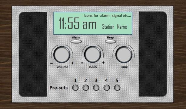
I used the majority of the mentioned colour techniques in the DAB radio to ensure it appeals to the large majority of end users. The reason I tried to use all of the recommended colour techniques was also to ensure the success of the design would be higher.
I can’t really comment on the behaviour models because that would involve me trying to run my design through one and that isn’t an option. What I will say is that I designed the DAB Radio with the end users in mind and as myself as someone that could use it. The interface has buttons and dials in place for easy access and it ensures that each button or dial is close enough so the user can use it effectively.
I have tried to ensure that those with specialist needs won’t struggle to use my device by using large fonts and placing font colours in front of a complementary backgrounds. I’ve also ensured that the buttons aren’t so close that it makes it tricky to press them but close enough that it makes the design sleek and effective.

The first device that comes to mind when specialist needs are concerned is the Nursery School Teachers Assistant device. The design itself was put together with thought of those with special or specific needs. The device offers a more modern and resistant way of learning for students. Traditional methods are still very useful today. They wouldn’t be considered standard or traditional if they weren’t. The device aims to give students a method of learning that best suits them. The device offers the 3 most common methods of learning, visual, auditory and kinesthetic. By allowing the user to pick what method they find more fun to learn in you are vastly increasing their learning potential and speed. Students struggle when they have no interest in a subject, not because they are incapable but because they find it hard to motivate themselves. Below you will see a list of the different types of input and how they could be implemented. By reviewing this list you should straight away see that it caters to learners no matter what learning style they prefer or require. By offering or providing the student a choice early on in life you are giving them a head start with their life long education.

  • Raised buttons to cater for the visually impaired (Also serves as a traditional way of inputting information into a device)
  • Speech recognition (The student or teacher can speak into the microphone and a relevant image will be displayed)
  • Text to Speech and Speech to Text
  • Auditory learning (The device could output letters, words and numbers in several different pre-recorded voices)
  • Touch screen (Allows for a more modern way of interacting with the device and also caters to those that struggle with other input methods)
  • Vivid Screen (The screen would have multiple settings but would by default display in very bright colours and big fonts in order to hold the attention of the students)
  • Expansion Bay for programmable cards in order to increase the amount of content the device has to offer

As you can see the device has been designed with most learning needs in mind, in order to cater for those that struggle with traditional methods. There is no reason why someone with a learning difficulty should be branded as an under achiever their whole life just because their needs weren’t met.

The task of designing 4 HCI’s (Human Computer Interface) is complete. I have designed 2 input and 2 output devices that meet the specification. The result is an interactive map of the United Kingdom that has potential to teach geography and history by allowing the user to browse each section of the map to find points of interest. The second HCI is an interactive Train Route Board. The board focuses more on getting students to their academic location rather than serving as an educational device directly. The board allows the user to interact with the train routes in order to find out information about their journey. The third HCI is a Nursery School Teachers Assistant. The device allows the teacher to present several topics to the pupils in a more user friendly and interesting way. The device would assist both teacher and pupil while learning about shapes, numbers, words etc… The final device is a 3D Car explorer. The device is aimed towards students taking a mechanics course at their local college. The device assists in teaching students about car parts and how they are made and how they function. This device would offer a more efficient and desirable method of learning to the student.